Charts
and Graphs Scavenger Hunt
Brooke Moore

Introduction| Task |Process |Evaluation| Conclusion
Introduction
We have been studying charts and graphs in class lately. You have all
had practice reading charts and graphs. We have also been discussing the
parts of charts of graphs and how they are put together. This exercise
will give you a chance to learn what goes into building a chart or
graph. This will also give you practice with some of the math skills
needed to pass the GED test such as averages and percentages.
You will be doing a Scavenger Hunt using the newspaper classified ads to find the information you will need to build your charts and graphs. Once you have found all of the information you will need, you will create two graphs and one chart. All of the supplies you will need are in the classroom. There are sample charts and graphs included in this packet that you can use if you need an example to help you. The Process
Get one set of newspaper sections from the table at the front of the room. Also get one set of materials that includes a pencil, scratch paper, graph paper, a round paper disc, a ruler and colored pencils.
1. Find the information needed to create a chart or graph
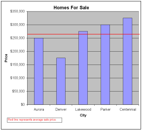
a. Find the homes for sale section of the classified ads.
i. Find six different three bedroom homes
ii. Each home should be in a different city
iii. Write down the price that each of the six houses is selling for. Round the number to the nearest ten thousand.
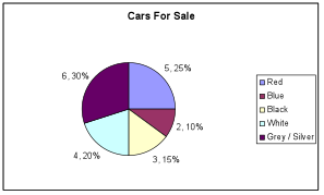
iv. Find the average price of the homes for sale using the rounded number.b. Find the used cars for sale section of the classified ads.
i. On your scratch paper, make columns for red, black, white, blue and grey/silver.
ii. Look through the used cars listed in the ads and put a tick mark under each color on your scratch paper when you find a car that is one of those colors. You will only count cars that match the colors listed above. Stop when you have found a total of twenty cars no matter how many you have under each color.
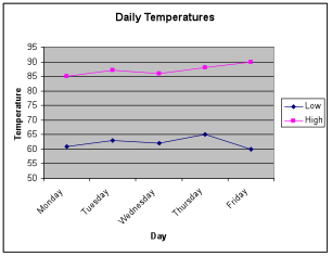
iii. Make a note of the total number of cars you found for each of the colors listed.c. Find the section of newspaper that has the weather forecast.
i. Look at the five day forecast and make a note of what the high and low temperatures are supposed to be for each day. Make sure to also write down the day of the week that each set of temperatures is for.
2. Make the chart and graphs
a. Make a bar graph using the used homes sale prices
i. Use a piece of graph paper to create your graph.
ii. You should have the sale prices listed on the side of the graph, the X axis, and the city listed on the bottom, the Y axis.
iii. Use one colored pencils to create the bars. You can use one color for all of the bars or use different colors for each bar.
iv. Use a line across the graph to show the average price.
v. Make sure to include a key to explain your line for the average price.b. Make a line graph using the temperatures
i. You should have the day of the week on the bottom, the Y axis, and the temperature on the side, the X axis.
ii. You should have one line for the low temperatures and one for the high temperatures. Each line should be a different color.
iii. You should include a key to show what each line represents.
c. Make a pie chart to represent the number of cars for sale for each of the listed colors.
i. Trace around the round paper disc to create the circle for your pie chart.
ii. Draw lines to divide your chart into pieces to represent how many cars there were for each of the listed colors. Make sure that the pieces of your pie are the right size to show the proportion (the number compared to the total) for each color.
iii. Use colored pencils to fill in the pieces of the pie.
iv. Next to each piece of the pie, list how many cars there was for that color and the percent of 100 that piece of the pie represents.
v. Make sure to include a key to show what color of car the pie pieces represent.
Evaluation
The chart below shows what you have to do to get the highest score on
this assignment. You can get a score between 0 and 50 points for each of
the two parts. You can score a total of 100 points if you fully complete
both parts of the assignment.
|
0 Points |
10 Points |
25 Points |
50 Points |
|
|
Gathering Information |
No information is found in the newspapers. |
Information is found for only one or two tasks. |
Information is found for all three tasks but part of it is incomplete. |
All of the required information is found. |
|
Making Chart / Graph |
No charts or graphs are completed. |
Only one or two charts are completed. |
All three charts / graphs are completed but data or keys are missing. |
All three charts / graphs are completed and contain all of the data and have appropriate keys. |
We have practiced several things you will encounter on the GED math test in this exercise, charts, graphs, averages and percentages. Now that you have seen how charts and graphs are built you will be better able to understand them when you see them on the test. When you see a chart or graph that is confusing, you can break it down into it’s individual parts and try to figure out how it was built. When you look at each individual part first, you can see more clearly what the whole chart is trying to tell you.
Sample Graphs